 |
| Via |
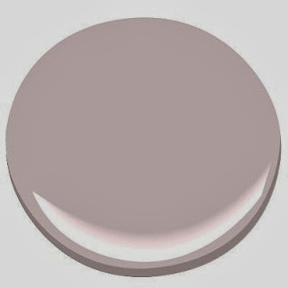
I have always had a love affair with the color pink, but generally gravitated towards bright bold pinks like fuchsia and magenta. In the past few years, soft pinks have become en vogue in home decor. I have grown to love those soft, "greyed down powdery pinks". Soft pink add glamour and evokes emotion in a room, without overpowering it. A subtle nod to flesh or skin tones, soft pink can easily replace white or beige and add a more interesting backdrop to art work or fabrics. So what is the secret to choosing a sophisticated soft pink worthy of adult spaces? Pink makes a statement all on it's own. Unless your goal is to have a bright "palm beach" influenced room, choose ethereal pinks that provide a wisp of color and suggest pink subtly. Recently, I was looking for a soft pink for a project and discovered some really beautiful ones.
Here are some of my current favorite soft powdery pinks.
1. Benjamin Moore "Blanched Coral" #886
Shown here with matching silk drapery and white bedding, this is color is
elegant and feminine but not overly girlie.
[click here to continue reading…..]
2. Benjamin Moore "Organdy"
Organdy tends to air on the side of lavender but still remains in
the pink family.
 |
| Credit via Hi Sugarplum |
3. Sherwin Williams "Verbena" #6581
Verbena is a little less gray and a little "more pink" than some of the
others chosen here. Shown here in the dining room of Cassie of Hi Sugarplum,
this pink pairs well with blues and blacks as evident from the drapery in the picture.
It's a happy pink that evokes an updated look.
 |
| Credit Brooke Gianetti |
Quaint Peche has a peachy undertone which is reminiscent of the interior
of a sea shell. This color is enveloping and works well with so many other colors.
It could be used in a monotone palette or as shown here with deep contracts.

 |
| Pink Ground by Farrow & Ball credit via Brooke Gianetti |
Pink Ground is a nice color for bathrooms, bedrooms or formal spaces. During the "glamour days of Hollywood" pink was often chosen for a room or to pink tinted bulbs in were used in lamps, to provide a more pleasing reflection to skin tones. To view pink ground click here.
 |
| Add caption |
6. Benjamin Moore "Marry Me"
Marry Me has a vintage feel about it. It's soft and moody. Reminiscent of bridal bouquets and flower petals. I have a male friend who actually painted his bedroom this color which totally debunks the myth that pink is for girls. This color looks great monotone or when mixed with gray, silver, black or brown. The black undertones add depth to this color and keep it from being too feminine.
 |
| Credit via Katie Lydon Interiors |
The perfect pink for a soothing backdrop.
I'd love it if you would follow Lisa Mende Design:
the scenes pics of our family holiday


I love pink. I used SW Faint Coral in my formal living room and BM Key Pearl in my daughter's bedroom. Both are very subtle pinks. I used them on the ceilings in those rooms also to really affect the light.
ReplyDeleteSounds beautiful! I'll check those out! Thanks for sharing Kerry!
DeleteWhat gorgeous pinks - loving the blanched coral! Happy Monday ~
ReplyDeleteHey Kristy & Beth! Thanks for popping by!!
DeletePink is my favorite color, alongside shiny and animal print, and one of the most difficult to get right on walls. Love these suggestions.
ReplyDeleteThank You!
Delete