Wednesday, January 30, 2013

Loving this look....

I'm off to Design Camp today with Lori Dennis & Kelli Ellis in Atlanta, so I thought it only fitting that I share Jamie Schoenborn, Creative Communications Director
 of Lilly Pulitzer and Georgia native's fab sale on Joss & Main!

The Sale is based on Lilly Pulitzer's Theme for 2013:

"Life's A Party, Dress Like It!"


I'm def a resort-chic kind of girl!  I could so live
at the beach year around! 

Every item in the sale would look fab in my beach house!

Have you checked it out? 

I'm only showing a few of the resort inspired goodies so make sure to
 pop over to Joss & Main to see the rest!


I'm digging this set of seaside bowls with tiny shell covered orbs. Great for displaying shells found on the beach!

Via

If you don't have a giant clam shell, here's your chance
to own one at a great price!  These are great to use as a centerpiece or ice
 it down and fill with your fav soft drinks for a unique cooler at your next party.
Via

The Genova trays are perfect for the bar or the coffee table
when serving drinks.
Via

Add the perfect touch of Palm Beach Chic with these great coral lamps, which would look great in a bedroom or living room.  Neutral enough to work with any decor!
Via


What a focal statement this great looking eta`gere would make in your home. I can picture it filled with beautiful coral, baskets and books to create a beautiful focal point as well as tons of great storage! With all the lovelies who would notice the flatscreen in the middle?
Via


Here's a look I put together with some of the
 items in the sale!


All items are available at the Joss & Main Sale here,
Except for that cute little dress and you can find that here!
Better hurry, things are selling out quickly! 

Speaking of "life being a party", it's only fitting Joss & Main would feature a sale like this since they were one of our gracious sponsors of Alt Summit!  Those people really know how to throw a party themselves!  We had tons of fun with them, but now it's back to work for all! 

Pin It!

Tuesday, January 29, 2013

Great Idea for Valentine's Day Gifts!!!


 The count down is on to find the perfect gift for your valentine.  What will it be?  

Do you have to ship gifts and have no idea what to send?  Candy only over rated, it only offers calories and cavities.  Sending flowers is really kinda ridiculous since they jack up the prices and we all know we can buy a perfectly good bunch at Trader Joe's for five bucks.   Why not give the gift that is sure to be a big hit?

GiftRocket!!!


Have you heard about GiftRocket?

It's the new, young, hip way to give a gift!

It's like a gift card only better!

This is what the card looks like

This is how it works...

1. You purchase the GiftRocket online and it canbe emailed to the recipient or printed out.  You can suggest where for them to spend it or leave it up to them.

2. They can redeem immediately via bank transfer, paypal,
check in the mail or credit card.

3.  They buy something they like, either what the gift giver suggested or something else without hurting feelings, or messy returns, exchanges,etc.


Why GiftRocket?


You can buy for friends that don't live in your city!


You can buy for use at businesses that
 don't have gift cards.


If the recipient doesn't want to use it the way
you specify, they can use it for anything they choose.

Got Questions?

check out the FAQs 
or 
email contact@giftrocket.com

Order your Gift Rocket now and forgo the last minute "walk of shame" at the drugstore! Your Valentines sweeties
 will be lovin' you on Heart Day!!  Oh and if you still want a traditional card to send along with your GiftRocket, make sure you order today at TinyPrints to take advantage of the 20%off discount I shared here or create your own darling little watercolor card, the step by step is here.!


(Gift Rocket sponsored this ad, but I truly do use and love this product
and I think you will too or I wouldn't share it with you!) 

All Graphics courtesy of GiftRocket


Pin It!

Monday, January 28, 2013

Reminder to Order Your Valentine's Day Cards & Get 20% Off Til Jan. 29th!

Valentines Day Card from Tiny Prints
Click Here to See !!!!!


Valentine's Day is almost here! 

If you have children in elementary school, you need to check out Tiny Prints' Classroom Valentines. 

Why settle for cheesy drugstore cards, when you can send beautiful, personalized cards to your loved ones!


Completely customize with your children's pictures, your own text and fonts you choose.


If your kids are too young, too old, or non-existent, Tiny Prints also offers great customized photo gifts and Valentine's Day party invitations, and their sister company, Treat has aweome personalized greeeting cards

Order by 11:59 pm PT January 29 and use the promo code 20JANSW to save 20% off your entire order! 

I'm off to customize my cards!!!


(Tiny Prints Is a Sponsor of Lisa Mende Design Blog)
This is an advertisement for Tiny Prints 
Pin It!

7 Steps to Happy - Stefen Sagmeister at Alt Summit 2013


Stefen Sagmeister

I seem to have taken a little side path on my road to authenticity.  I think that is ok to do that, if it brings value to your life or even just a single day.  The past five days I have been in Salt Lake City at AltSummit.  It was my first time to Alt but it won't be my last.  I met some wonderful people, heard inspiring speakers and came away feeling like I have tons of work to do to catch up to the amazing creativity I witnessed.  I have feelings of "getting with the program" mixed up with "stop and smell the roses".  Not sure which will win or if I will find a balance of the two, but either way, I feel richer for the experience.  There were so many great things to experience at Alt but this was one of three which really resonated with my soul.  I will share the other two in the next couple of days.  

Photography by Karen Walrond of Chookooloonks

First, Stefen Sagmeister, the famous master guru of graphic design was a keynote speaker, who first shocked us by opening his speech with nude pics of himself.  The pictures were his calling card when launching his new business to clients.  After that point, he had our attention for the next hour, while he explained his new project "The Happy Film" which I cannot wait to see in its entirety. The twelve minutes we saw left me wanting more. Actually, his entire speech left me wanting to know more about Stefen Sagmeister and how his brillant brain works.  It was an amazingly insightful hour of rethinking everything I have ever thought about "being happy". He talked about his seven rules for making more happy . He shared the statistics his firm had gathered for happiness.  One statistics that surprised me was that  the person who makes $50,000 a year is as happy as the person who makes $350,000 per year.  He said anything over $50,000 bring minimal happiness to the person.  
Stefen takes a year off for every seven years of work, to mediate, and gather inspiration.  He shared film clips of his last sabbatical.  During his sabbatical he continues to do research on his topics.  Wonder what our lives would look like if we adopted his 7 year sabbatical idea?

So what makes you happy?  Have you thought about it?  Stefen said he is a big list maker and he sat down and wrote out all the things that made him happy.  Have you ever done that?  I'm working on my list and suggest you do the same.  
That's the first step in identifying how to get happy if you aren't totally happy.  Join me on step #1 ...

What Makes Me Happy?
What Makes You Happy?

**************************

If you haven't signed up for Design Camp in Atlanta, Ga with Kelli Ellis and Lori Dennis, run don't walk...only a couple of tickets left!!  The line up of speakers is fabulous!  The who's who in the industry will be there!  You don't want to miss out!!!


Pin It!

Saturday, January 26, 2013

My Biggest Takeaway from Alt Design Summit 2013


I got it! I think I totally got it! Be original!  Content is king!
Be the best you can be!  Creative, creative, creative!!!
Below are my final notes on Alt Design Summitt! Read them and weep!  Haha!! Just kidding!  It was awesome!  
Can't wait to share!


For now I am headed to the bar for a nice glass of wine,
 a good dinner and some downtime before packing!!!!!

Alt was Awesome!!!!!
Pin It!

Wednesday, January 23, 2013

Up, Up & Away to AltSummit!!!!


By Jenny Batt. Photography by Flint Knits.

I'm on my way to Alt Design Summit in Salt Lake City, Utah!  To say I am excited is an understatement.  Alt is a conference for design, fashion, food and lifestyle bloggers.  It's "THE" place to learn cutting edge blog design methods and smart ideas for social media.  There will be fashionistas, interior designers, foodies, photographers, and lots of other fab people who will connect with marketers, share ideas and come together for informative panels and workshops on every aspect of blogging. Old friends will reconnect and new friends will be made!  

I am also very excited about the line up of speakers!  This event brings out the biggest names in lifestyle blogging.

Here are some of my favs....

Camille Styles, Camille Styles

Darcy Miller, Martha Stewart Weddings


Emily Henderson, Style by Emily Henderson


Erin Loechner, Design for Mankind


Kelly Beall, Design Crush


Jenny Komenda, Little Green Notebook


Jaime Derringer, Design Milk


Meg Biram, megbiram.com


Kirsten Krason, 6th Street Design School


There are so many more I can't wait to hear and meet!  Reading some of these blogs daily like I do, you begin to feel like you really know these people!  I will have to restrain from running up to some of them and giving them a big hug!  Some of them really are my friends and I will be giving them a hug!


There are so many great panel discussion I am having a hard time trying to decide which ones to go to.  Not to mention the keynote speakers are ah-maz-ing!  They are Stefan Sagmeister of Sagmeister & Walsh and Chris
 Anderson, 3D Robotics!

It is an action packed schedule for sure! 
To put it simply, Alt Rocks!

By Sara Urquhart. Photography by Alt.

Make sure to follow me on Facebookinstagram and twitter! While I am at Alt I will be blogging about the conference.  Rumor has it Jessica Alba will be here touting her new line The Honest Company!  
Can't wait to share more!

Pin It!

Tuesday, January 22, 2013

How to Get High Style On a Budget!


I was excited to be included in the ivillage round up for "How to Get High Style on A Budget". Let's face it we all like it when we can get a "designer look" without paying the big bucks, right?  For me, living authentically means living within your budget, which  translates to trying to decorate without spending tons of money.  Here are great ideas from some of my design buds that are worthy of a gander.  My friend Traci Zeller suggest using an affordable chair from Ikea with a slip cover in a child's room.  What a great idea! The slipcover can be removed for ease of cleaning. She added grosgrain ribbon on the skirt to co-ordinate with the room


My friend, Ann McDonald has a couple of great ideas, first she created a great looking headboard by using a screen she found at Cost Pluss for $39.99


Ann also created this inviting dining space with items
 typically used for outdoor entertaining.  


My friend Emily Clark of Emily A. Clark Design Simplified blog talks
 about using matchstick blinds for a layered
 effect for your windows...


My friend Heather Grahling from Vivid Hue Home 
shows how to use high/low products in a room to save your budget.  
She uses her own sunroom as an example of high/low design.  


So many awesome ideas!  Be sure to pop over and read all the great ideas
 for getting style on a budget by clicking here!

Hope your Tuesday is awesome!
Pin It!

Monday, January 21, 2013

January Olioboard Hop: A Quicker Way To Stage Your Home For Sell


I am excited to be participating in the first Olioboard hop of 2013!!!  I am one of ten designers,home stagers, architects and industry partners sharing tips on the before and after process of how to stage your home for resell.

As a designer, I don't stage many homes, but from time to time my clients ask me to help them prepare a home I have designed for resell.  I also have several builders who hire me to stage new properties for the market.

What are some tips for successful home staging?

 Let's try a little exercise and see what you think....


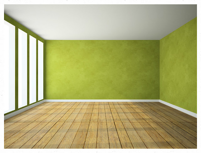
 Can you envision what the use of this space might be?  A dance studio, an office, a family room in a loft apartment or something else altogether? It's hard to visualize what a room's purpose is without furniture, right?

Before:

After: 

Here is an example of what the room above would look like if furnished.  Can you now envision the use of the room? 
The empty room suddenly becomes a living room with an dining area and a study with the help of Olioboard!
Can you see how this room is more appealing as a furnished room?  The furnished room invites you in, whereas the unfurnished room leaves one wondering what to do with the space. Which room do you think would most likely make this home appealing to a buyer? The furnished room is more appealing, right?


For the sake of the exercise, lets say the space above is a New York Loft and belongs to a young couple without much furniture.  It is only about 1000 sq ft,  and this is what it looked like before we staged it.  They bought a few things but didn't really want to invest in much because they felt their time in the loft would be temporary.  

Before:

As you can see the space wasn't very well utilized.  It's cold and drab. There is no comfy spot to relax.  The art was too small and did nothing to enhance the beautiful brick walls or architectural features of the room.  Without insulting the clients, I am able to demonstrate on Olioboard how this room can be more inviting and create the necessary spaces buyers would be looking for in the property.

Again here is the "After" of the Space once Staged:


Can you see how a quick visit on Olioboard can demonstrate to the homeowner the room's potential without even lifting a finger to accure furnishings?


Builders, real estate professionals and home owners  turn to designers and home stagers to stage homes to appeal to a general population and help a speed up the selling process.   There are many steps required to properly stage a home.     As I have shown you above, Olioboard can shortcut the process and allow the home stager to create a quick visual  showing the client the potential of what can be achieve before any purchasing or actual work has happened. 


Have you ever thought of staging a property using
Olioboard?  With Olioboard, a photo can be taken of any room and uploaded to the Olioboard app then used to create a visual of  the room furnished as an office, bedroom, dance studio or any way you choose to furnish the room. Below are tips I generally incorporate into my home staging process.  These are basic tips that are necessary to the process.  Each  tips can be easily demonstrated using Olioboard.


1) Have clear definitions of the spaces. 
Notice how we created a living space, dining space
 and study space above. Below, this room could be anything but unless it is defined, the buyer might not see the value of the space.  Don't make the buyer guess, show them the value of the room by creating a specific use for the room.

Before:

After:
Suddenly the empty room without purpose becomes
 a media room!


2) Remove any personal items so the buyer
 can envision themselves in the space.
Family photos, toys, etc. 

Before:

Room with Family Photographs over sofa

via

After:

Photographs are replaced with a large piece of art and a couple of throw pillows.  When you remove the personal photographs from a house, you take "you" out of the house which allows for the buyer to visualize themselves in the house.  

via

3) Remove clutter and streamline the look.
No one wants to see piles of books or
stacks of clothes.  If the room is
neat and well organized, the space
 appears to have adequate storage. Rid rooms of
 excess items, a few well placed items makes a
much bigger statement etc.  Fresh flowers add a
 nice touch as well.

Before:


After:


4)  Remove approx. 50% of the furniture to make the
space seem larger and allow for traffic flow or replace with
pieces which make the room have greater use.

Before:
Too busy!!!


After:

Remove the jumble of pictures that don't relate and make a more cohesive vignette!  Notice there is less art, and one of the table has been removed.  The floor lamp doesn't take up as much visual space as the original floor lamp. 
Cleaner lines are created in the room with a more clearly defined purpose. 


5) Choose a warm neutral paint and use it in all the rooms, the rooms will flow into each other creating unity and visual space.  This keeps the floor plan from feeling choppy. It is ok to have an accent wall but try to keep the main portion of the home fairly neutral.

Before:

Room with strong green walls

After:

The sofa wall was wallpapered in a neutral and
 only one accent wall in the strong green was left.  The wall opposite the large window was left green because it can serve to reflect nature through the large window.


Those are just a few ways Olioboard can help streamline the process of home staging.  Can you see how helpful Olioboard can be to the home staging process? 

When creating boards on Olioboard one can pick from Olioboard's list of retail partners available on the website or use the furniture the homeowner already owns, by simply taking a photo and uploading it to Olioboard.  


If the home owner decides to move forward with physically staging the room  he or she has the options of following the boards that have been created by the designer/stager and doing the work themselves or hiring the designer/stager to finish the process.   

Olioboard can be especially helpful for builders and real estate agents as well.  Instead of furnishing a spec home with costly furniture and accessories, the builder or real estate agent could hire a stager/designer to create boards for each room of the house. The boards could then be displayed in the rooms with various options for furnishing the room.  The saving created by not having to purchase furniture or paying for acquiring and installing the furniture, art and accessories can save the builder, real estate agent or home owner a lot of money.   They would simply pay design fees for the boards created for each room.  It is easy to create several options for each room and display.  For example a bedroom  could be furnished as a guest room, a baby's room or a home office.  By creating the various options for the rooms, Olioboard opens up many options for the buyer to consider.  Often there are options created with Olioboard the buyer would not dream up on their own. This could also work for the homeowner as well.  A basement room used for recreation could also make a great space for a seating area.   The homeowner could have the designer/stager create an Olioboard showing the space used as a living space.  The homeowner continue to use their recreational items while the house was is on the market, yet the buyer could visualize what the space would look like for another use.  This could also be used for unfinished spaces as well.  An Olioboard could be created to show what the unfinished space could look like finished which instantly adds value in the mind of the buyer.

The next time you must home stage a property for sell, try Olioboard and see for yourself how it makes the job so much quicker and easier. 


Here's an added tip for the seller:

Always have a couple large laundry baskets in the garage, for those times you get the spur of the moment call to show the house, you can gather any piles of mail, errant clothing, or other messes and load in your car to take with you.  It's a quick way to straighten your house and do away with any messes. Don't ever  think of cramming the messes in a closet because that will be the very closet the buyer decides to open!


Check out my fellow Olioboard Hop Participates here for their great tips on before and after home staging:

Please follow more Before and After staging tips from my fellow #OlioHop friends by clicking on their links below. Happy OlioHopping!


Frances Newman - As You Like It Redesign: Blog * Olioboard
Stephanie Weeks - Interior Design HQ: Blog * Olioboard 
 Marilyn Russell - Design Magnifique: Blog * Olioboard 
 Lynda Quintero-Davids, NYCLQ Focal Point: Blog * Olioboard
Ronique Gibson - Stagetecture: Blog
Kristie Barnett - The Decorologist: Blog * Olioboard
Roslyn Ashford - Ra ReDoes Rooms: Blog * Olioboard
Williams-Sonoma Design Marketplace: Blog * Olioboard
Linda Merrill - Decorative Surroundings: Blog * Olioboard


For more information on Olioboard, please click on the following links:http://olioboard.comhttp://facebook.com/olioboardhttp://twitter.com/olioboard and Olioboard's video tutorial You Tube channel: http://youtube.com/user/olioboard.Please follow more Before and After staging tips from my fellow #OlioHop friends by clicking on their links below. Happy OlioHopping!


Pin It!